Fundamental Strategies
Jump to Strategies:
Branding Fundamentals
Passenger Information Fundamentals
Awareness, Image, and Support-Building Fundamentals
Generating Ridership Fundamentals
The fundamental communications strategies that should be implemented by every transit system are branding and passenger information. These are the most basic, and absolutely critical, strategies for success in your marketing program. They are the essentials that identify your service to the community and provide directions for using it. In addition to these, this section includes very basic strategies for communicating with your news media and key stakeholders. If you implement the strategies outlined in this section, you will have the foundation of an effective marketing program.
Branding Fundamentals
For more on transit branding and other awareness-building techniques,
click here to watch the Marketing Workshop #1: Build Awareness webinar.
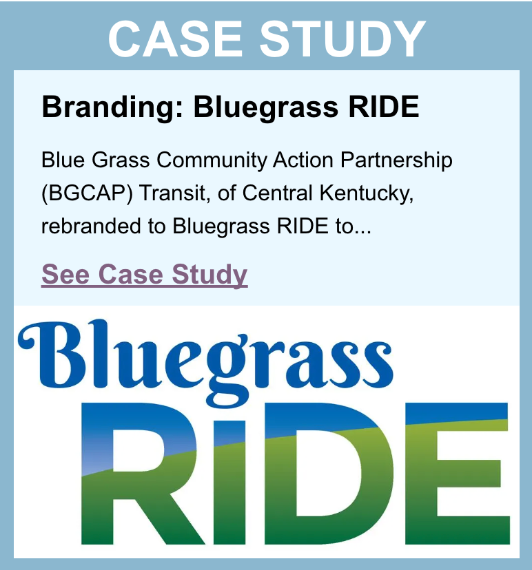
Name
A system name should be short and easy both to say and to remember. It also should communicate the nature of the service and the service area. A few things to keep in mind when selecting a name for your transit service:
- Acronyms are short and easy to use, but not generally very friendly or descriptive unless they actually spell a relevant word.
- Very long names are difficult to use and generally end up getting shortened to acronyms (hence Helena Area Transportation System was briefly styled as HATS, which has little to do with transportation, before rebranding as Capital Transit).
- If your service is general public transit, be sure that the name conveys this fact.
For example: The demand-response transit services in Douglas County, Oregon, evolved from being Douglas County Special Transportation, to Douglas Rides. The new name is easier to use and avoids limiting the perception of who can use the services, which are open to the general public.
Logo
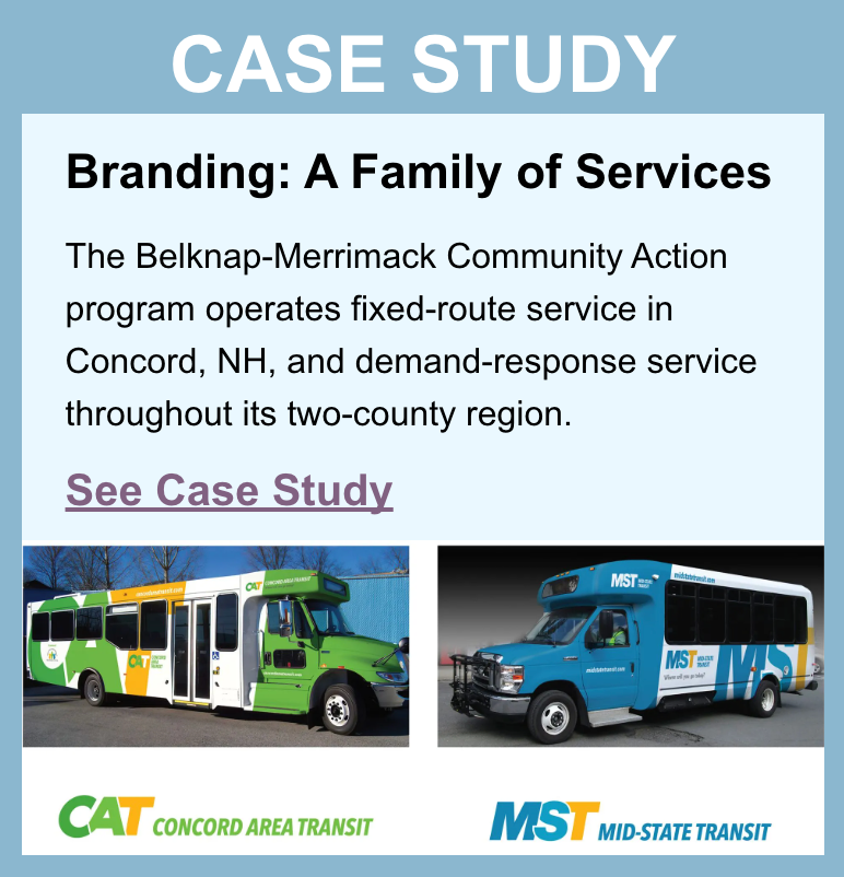
Vehicle Graphics
Vehicle graphics can turn a simple bus into a rolling billboard to market your service. Not to be confused with exterior transit advertising, such as bus wraps, which can be sold to generate revenue, branding vehicles involves using them to build visibility for your
own service and communicate clearly that this is public transit.
For optimum effectiveness, vehicle graphics should include:
- A distinctive base color used consistently for all vehicles. This becomes the “color of transit” in your community. (It is important to note that all-white cutaway vehicles, without significant branding and design elements, are often confused with social service vehicles or RVs, and are not perceived as public transit.)
- The logo, phone number, and website address.
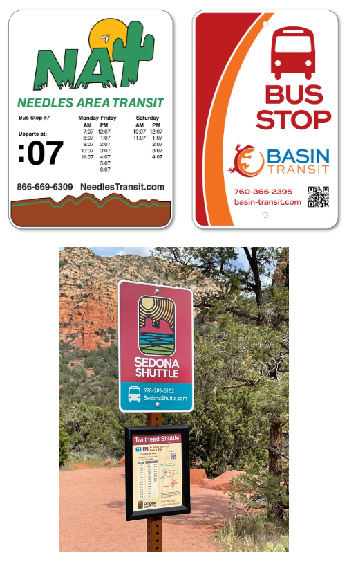
Bus Stop Signage
Bus stop signage is another key element of branding, an important passenger information tool, and a marketing strategy that provides value every day:
- It lets passengers know where they can catch the bus.
- It creates system visibility throughout the community.
Because it advertises the availability of transit service within a given area or to a specific destination, information at the bus stop is particularly important for building ridership among transient populations such as visitors and college students, and for encouraging first-time use by new riders.
Bus stop signage should be implemented along all fixed routes, identifying each stop with a permanent sign that includes, at minimum:
- System logo
- Universal bus symbol and/or the text “Bus Stop”
- Telephone number
- Website address
Bus stops are also a place to provide additional information about routes and schedules. This is addressed further in the “Passenger Information at the Bus Stop” section.
Bus Stop Facilities
Shelters and benches at major bus stops increase the visibility of the stops. These amenities are as much a part of the system’s brand as the buses themselves. Their style, color, and quality should be consistent with the overall image you are trying to create.
Passenger Information Fundamentals
Some of the tools discussed in this section are fundamental for all transit agencies, while others will be relevant only for specific types of systems. Which information tools you use for your system should be based on what services you provide and a thorough understanding of your passengers and their needs.
Passenger information tools discussed in this section include:
We will begin with the three tools that are fundamental to all transit systems—a website, basic passenger guide, and telephone support—then continue with strategies that are critical to specific services.
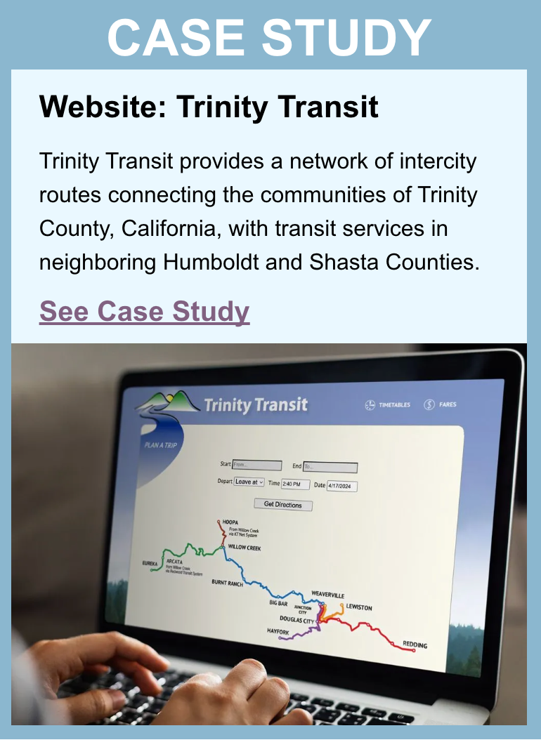
Website
Check out National RTAP’s Website Builder
here.
For more on how to build a customer-focused website,
click here to watch the Marketing Workshop #2: Transit Websites webinar.
Website Content
Your website is the one place you can include complete information about every aspect of your transit service. Unlike a printed guide or sign, your website is not limited by space—but it is limited by the viewer’s attention span. That means the way information is organized on your website is very important. Hence, the top of your home page—the area that is seen immediately when someone comes to your website—is the most important space and should be reserved for critical, customer-focused information.
Ideally, the website home page should include the following elements:
- Menu/navigation bar providing immediate access to key information:
- Routes/schedules
- Demand-response services
- Fares
- Customer service
- Trip planner based on Google Transit (for fixed-route services).
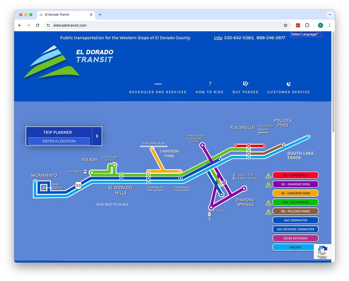
- A map that provides an overview of your service area so viewers can see where transit goes. On a website, it is easy to make a map interactive by including hyperlinks from the route line, demand-response service areas, or legend to schedules or information about specific services.
- Rider alerts for weather, holidays, and other important notices.
The El Dorado Transit website shown here is an example of this approach. For additional examples, see
TrinityTransit.org,
MendocinoTransit.org,
SageStage.com,
KernTransit.org, and
SedonaShuttle.com.
Like the home page, secondary pages are best kept short so that no scrolling is necessary.
Key secondary pages (those linked to from the primary navigation bar) should provide the following information:
- Fixed-route service: Individual route maps, displayed along with the schedules for those routes.
- Demand-response: Information about service area, hours, and how to make a reservation. Note: A map of the service area is very useful for demand-response services to let potential riders see if their origin and destination are within the service area.
- ADA complementary paratransit: Clear information about service area, hours, reservations, and eligibility, including a printable ADA application form.
- Fare information and information about fare media and where to buy it.
There is likely a great deal of other information that your agency will need to include on the website. Some of this will be rider-focused, other material will be administrative information. This less-critical information can be provided via links from lower on the home page. The top of the page should be reserved for the most important information: that which helps riders plan a trip.
Information that might be linked from a footer could include:
- Rider-focused information:
- Contact form or information for submitting comments, questions, or complaints
- Holiday calendar
- Wheelchair accessibility information
- Bike rack information
- Links to websites for other transportation services, such as intercity bus, social services, and taxis
- Administrative information:
- Title VI statement and complaint form
- ADA complaint form
- Agency policies
- Transit plans
- Board members (and their contact information, if appropriate)
- Board meetings and agenda, and any other transit-related community meetings
- Employment notices
- Agency mission statement and history
Note: Schedules displayed in HTML format are easier to read than PDFs or graphics. The HTML format also allows the schedules to be accessed by persons with sight impairments, using a screen reader, and by search engines. You may also wish to provide a PDF link for easy printing.
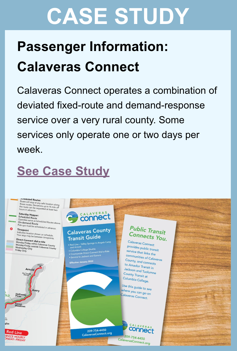
Printed Guide
For more on creating effective passenger guides and other information tools,
click here to watch the Marketing Workshop #3: Passenger Information webinar.
Check out the printed guide templates
here.
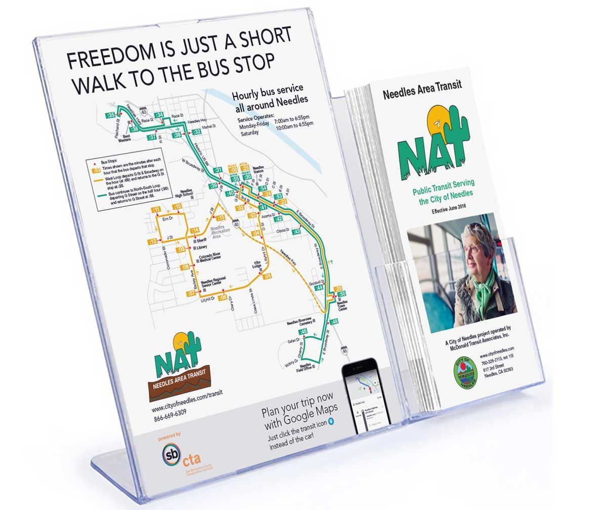
Whatever type of service you operate, a printed passenger guide is an important companion to your website and a key marketing tool. A printed guide offers several advantages: it appeals to passengers who are less tech-savvy, it has the potential to build awareness of the service through distribution within the community, and it allows for easy display of maps and schedules in a “take-along” format.
A passenger guide for a fixed-route service should include:
- A route map or maps showing all routes with bus stop locations, landmarks, and key destinations clearly noted
- Schedule information for each route
- How-to-ride information, including fares, fare media (such as tickets and passes), how to identify a bus stop, and any other information specific to your service type (i.e., how to request a deviation, how to apply for paratransit certification)
- Contact information, including a website address and reference to Google Maps trip planning, if that is available
Telephone and Email Support
One of the most basic and essential means of communicating passenger information is the telephone. While it should not be the primary source of information, it is particularly important for certain constituencies, including older adults and people with low literacy.
The telephone number for a system should be easy to find. It should be displayed prominently on bus stop signage, on vehicles, on the website, and in all printed materials. If your community has a local printed phone book, it should be listed there, too.
Options offered on an automated phone answering system should be very clear and should include an option for speaking with a real person.
If your community has a significant non-English speaking population, language accommodations by way of a bilingual staff member or a translation service are necessary.
You can also provide support via email. If you haven’t already, consider creating an email address such as “info,” “support,” or “help.” Designate someone to monitor this address. When you mention this address in any public-facing materials, list the hours during which the address is monitored.
Google Maps and Other Apps
Consumers have become used to relying on smartphone apps for a variety of tasks, particularly getting driving directions. Getting transit directions or scheduling a transit trip can be just as easily accomplished using Google Maps or one of many transit apps such as Transit and MoveIt. This can help overcome the perception that public transit is too hard to understand and use.
Apps for Fixed-Route Services
Apps for Demand-Response
Smartphone apps can also enhance the user experience for demand-response riders by allowing riders to schedule and manage trips, pay their fare and track their ride, all from their smartphone. Software systems can also make automated calls to remind riders about scheduled trips and alert them when the vehicle is approaching.
Unlike Google Maps, most of these apps are commercial apps offered by software companies such as TransLoc, EcoLane and Trapeze.
Rider Alerts and Social Media
Another option for providing updated information to customers is to allow passengers to sign up to receive alerts via email or text message. Alerts can be issued to let customers know about service changes or disruptions (e.g., service cancellation due to bad weather).
A simple sign-up form on your website can allow passengers to “opt in” to alerts. The ideal is to allow those requesting alerts to specify which services they want to be informed about, such as a specific route or community. One option for issuing alerts via text and email is Simplify Transit. Contact information is included under “Resource List.”
Service alerts also can be issued using social media apps such as Facebook, Instagram and X (formerly known as Twitter). However, if you want to ensure that riders see critical alerts, a text or email system is preferable.
At the Bus Stop and On the Bus
We’ve already talked about the important role that bus stops play in branding and building visibility. Bus stops also are an opportunity to provide route and schedule information at the point when the rider may need it most—when they are ready to take a trip. There are a number of ways in which information can be provided at the bus stop:
Awareness, Image, and Support-Building Fundamentals
While effective branding is the most fundamental awareness building strategy, there is one other strategy that is essential for building support for your agency and a positive image. That is the regular distribution of information about your system and services through local news channels.
Media Relations Basics
Stories in local news publications and websites, as well as on radio and TV stations with local news coverage, can increase awareness of public transit and educate residents about what it has to offer.
Here are some best practices for media relations:
- Know your local media. Maintain a list of publications, websites, and channels with up-to-date contact information.
- Establish a relationship with reporters and editors. Call or write and introduce yourself. Invite them for a tour. Comment on their stories. Be available to answer questions.
- Provide them with a regular stream of information about your transportation services to increase news coverage about public transit.
News Releases
Check out news release guidelines
here.
Providing news channels with well-written news releases makes their job easier. A well-written news release includes the who, what, when, where, why, and how of the information you want to share.
- Organize the information from most important to least important. When space is limited, newspaper editors remove text from the end of your story.
- Write in a newspaper style. Use short sentences—20 words or fewer. Keep vocabulary simple and avoid jargon. Make paragraphs short, focusing on a single thought.
- Write in a facts-oriented, educational fashion. Do not try to “sell.” If you want to include opinions or interpretations, include them as quotes from an agency official (e.g., general manager or board member), being sure to give the speaker’s name and title.
- Be sure to include the date the news should be released and provide a contact phone number and email address that reporters can use if they have additional questions.
Create a news release calendar to identify newsworthy activities going on at your system and anticipate key dates when you want to release news stories. News release topics might include things like:
- Service changes or new services
- New vehicles or facilities
- New passenger information tools
- Special event services
- Tie-ins with local events (such as the county fair)
- Public meetings
- Promotional activities (free-ride day, holiday food drive)
- Milestones (100,000th rider, or 10-year anniversary)
Update the news calendar periodically to reflect changes and new story ideas.
Email or fax the news release to the appropriate editor or reporter at the publication or channel. Be sure to include your contact information in case they have questions. You may want to call to make sure they received it and ask if they need any additional information. This is a good way to encourage them to pay attention to your releases.
The next section, “Recommended Strategies,” identifies many additional ways that you can get your news out to the community. But if your resources are limited, issuing news releases to local media is fundamental.
Generating Ridership Fundamentals
There are hundreds of strategies that can be used to generate trial ridership. Many of these are discussed under “Recommended Strategies” and “Optional Strategies.” However, one approach to building ridership is fundamentally important for any kind of public transportation service. We will refer to this as “gatekeeper communications.”
Gatekeeper Outreach
For more on working through gatekeepers to implement community-based marketing,
click here to watch the Marketing Webinar #4: Community-Based Marketing webinar.
Gatekeepers are organizations and individuals who can provide access to an audience of potential riders. These include:
- Social service agencies and human service organizations
- Employment programs
- Senior centers and complexes
- Schools and colleges
- Youth programs
- Libraries
- Recreation centers
- Support organizations for persons with disabilities
- Medical clinics and facilities
- Addiction recovery organizations
- Criminal justice system and courts
Note that this list is just a thought-starter. Think about the audiences you’d like to reach in your community and the organizations already in touch with those populations.
These organizations, and particularly their front-line employees, often are charged with identifying transportation options for getting their clients to programs, appointments, trainings, classes, interviews, and jobs. As a result, they have the potential to serve as salespeople for public transit.
To capitalize on your relationships with gatekeepers and their potential to be marketing partners, start with these three steps:
- Establish a list of gatekeepers for the target markets in which you hope to build ridership. Create a simple database that includes the organization, contact person, and contact information, including email. These individuals should be provided with regular email updates about changes in transit services and programs, availability of new passenger guides, and other updates.
- Solicit opportunities to conduct training sessions at meetings of front-line staff who need to understand how transit works so they can pass the knowledge on to their constituents. For example: front-line staff might include social service caseworkers, medical office staff, or student services staff at a college. These sessions should include an overview of the service area and your transportation services, including relevant information for sharing with their constituents such as service area/system route map, how to use the schedules to plan trips, how to use the Google Maps trip planner (if available), and information about demand-response reservations and ADA paratransit eligibility.
- Work with the gatekeepers to identify ways that you can market to their constituents. A variety of communication channels generally can be accessed through partnerships with gatekeepers:
- Permanent information displays in their facilities
- Distribution of customized information
- Bulletin board posters and flyers
- Inclusion of transit information in orientation packets
- Website links
- Email blasts
- Social media posts
- Newsletter articles
- Travel training presentations
- Prepaid fare programs
These various communication channels are detailed under “Recommended Strategies.” Note that it is not necessary to do everything with every organization. Gatekeepers know what works best for their populations.