Intro to Passenger Information Design
Marketing Toolkit
Intro to Passenger Information Design
Improving the design of your passenger information is one of the most important things you can do to increase the use of your transit system. User-friendly passenger information should be considered a core part of your transit service, as well as a marketing tool. To effectively market your transit system, you need to make your system easy to understand and navigate–and your passenger information is integral to that effort.
Using transit can be intimidating to a first-time rider. When they look at your transit map and information, you have mere seconds to convince them that they can figure it out before they give up and find another alternative. Clear, easy-to-understand information can help turn potential riders into riders.
When designing passenger information that is easy to understand, it is helpful to imagine that you know absolutely nothing about the transit system and that you are trying to learn how to use it for the first time. What questions would you have and how can they be answered in a way that communicates quickly and easily?
Keep it Simple
One of the most important rules of passenger information design is to keep everything as simple as possible, without leaving out any critical info.
Maps
Maps can answer the key question, “Where can I go on transit?” They are useful both for communicating fixed routes and demand-response service areas. They can communicate a lot of information quickly, where buses go, and what destinations are served. However, it is important to keep them simple by only including what the passenger needs to know.
For route maps, this usually means providing just enough detail to show clearly where a route travels, but not providing more detail than needed. For instance, all the streets that a route travels should be named, but cross-streets are only named if they are major roads, are where bus stops are located, or are popular boarding locations.
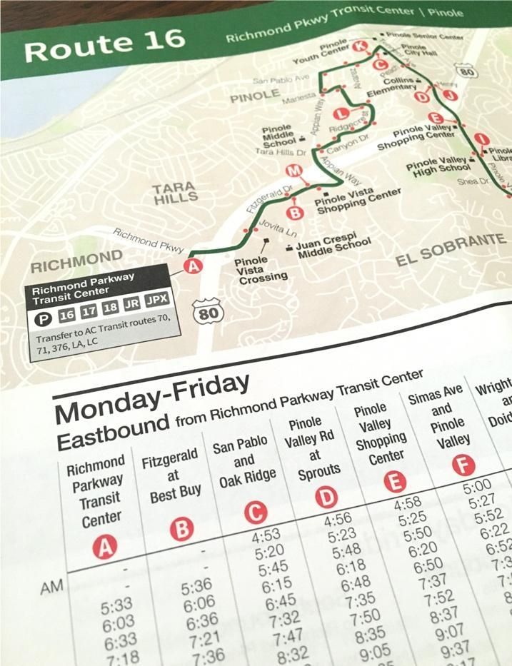
Maps and Timetables
If you are designing maps and schedules–for a single route or many routes–it is helpful to visually connect locations on the map with the same locations on the timetable. One way to do this is to use a “timepoint” letter or number. In the example shown, letters within bold red dots are used to indicate a location on the map and the same location on the timetable.
This helps a user find the proper part of the timetable to look at based on their boarding location.
Information Hierarchy
In the context of information design, hierarchy refers to creating an order or flow to how information is read. Think about what the first piece of information is that a user might need, then the second, third, etc. For instance, when looking at timetables, a user usually needs to first find the correct timetable for the route and day of week–so those might be the largest or boldest text on the timetables. Next, they might have to distinguish between a northbound and a southbound schedule, so that might be the next piece of information and the next largest or boldest. Then they might need to find timepoints, then trip times.
Think about this flow of how information is read, whether it be a map, timetable, how-to-ride, fare, or any other information.
Passenger Guides
In any passenger guide, it’s useful to include enough information for a potential customer to be able to take their first ride. This means that you have to think about everything a customer needs to know–fares, how to pay, and how to catch the bus (do you have bus stop signs, or can they catch the bus at any safe location along a route?).
When designing a passenger guide, look at the guide and think about what a potential rider’s next steps would be if they want to take a ride. Do they have all the information they’ll need?
Always include prominent contact information so that if a potential rider doesn’t have all the information they need, they’ll know where to find more information, whether it be your website or by calling your transit information phone number.
Consider putting information that is only relevant to some riders, such as long lists of rules or policies, on your website and not in your guide. In this way, you can retain the valuable space in the guide for the information most important to all riders.
More information and templates:
Next page: Maps
Updated June 20, 2024

A program of the Federal Transit Administration administered by the Neponset Valley TMA
National RTAP is committed to making this website accessible to persons with disabilities. If you need assistance accessing any content on our website or need alternative formats for our materials, please contact us at info@nationalrtap.org or 781-404-5020.