Colorblindness
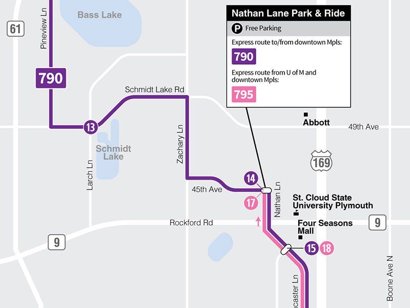
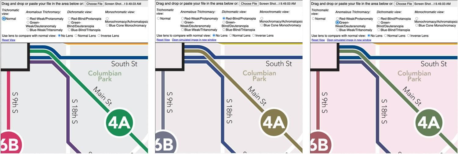
About 8% of all men and 0.5% of all women are colorblind. While the use of color can be a great way to distinguish pieces of information on a map, it’s important not to rely solely on color. If route lines are different colors, be sure that space between them helps differentiate them, and that the route numbers or names are placed on the map to make it obvious which line it is referring to.
You can test any map to approximate what it looks like by using a colorblindness simulator such as
Coblis. Save your map, or a portion of it, as a JPG image, and upload it to their website to see a simulation of what it would look like to people with various forms of colorblindness. The most common types of colorblindness (and thus the most important to test for) are deuteranomaly, deuteranopia, protanomaly and protanopia.
Creating Transit Maps using Google Maps
Google Maps can be a good source for a background map to draw your route maps on. Unfortunately, Google Maps doesn’t have a way to export an image, so the best way may be to take a screen shot of the area. But before you do that, explore the options for different types of maps.
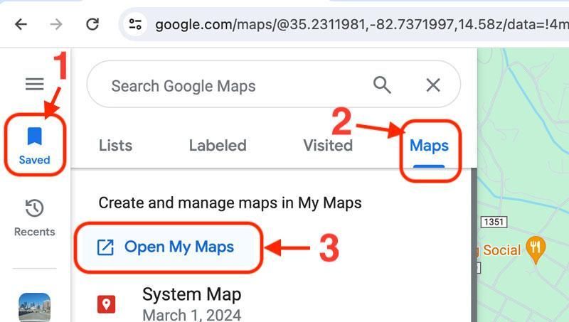
- Be sure that you have a Google account and are logged in when you go to google.com/maps.
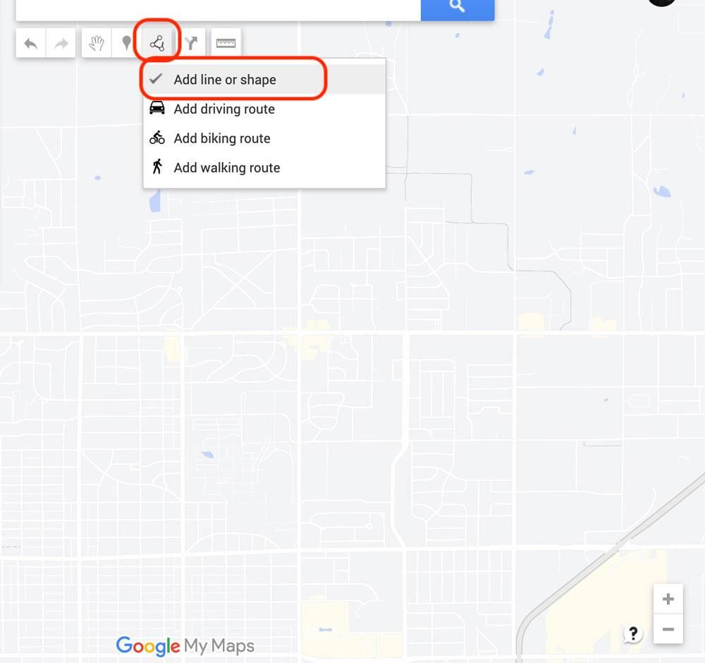
- Click the
Saved link in the left toolbar.
- In the menu that pops out, select
Maps.
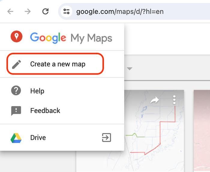
- Click
Open My Maps, then click
Create a New Map.
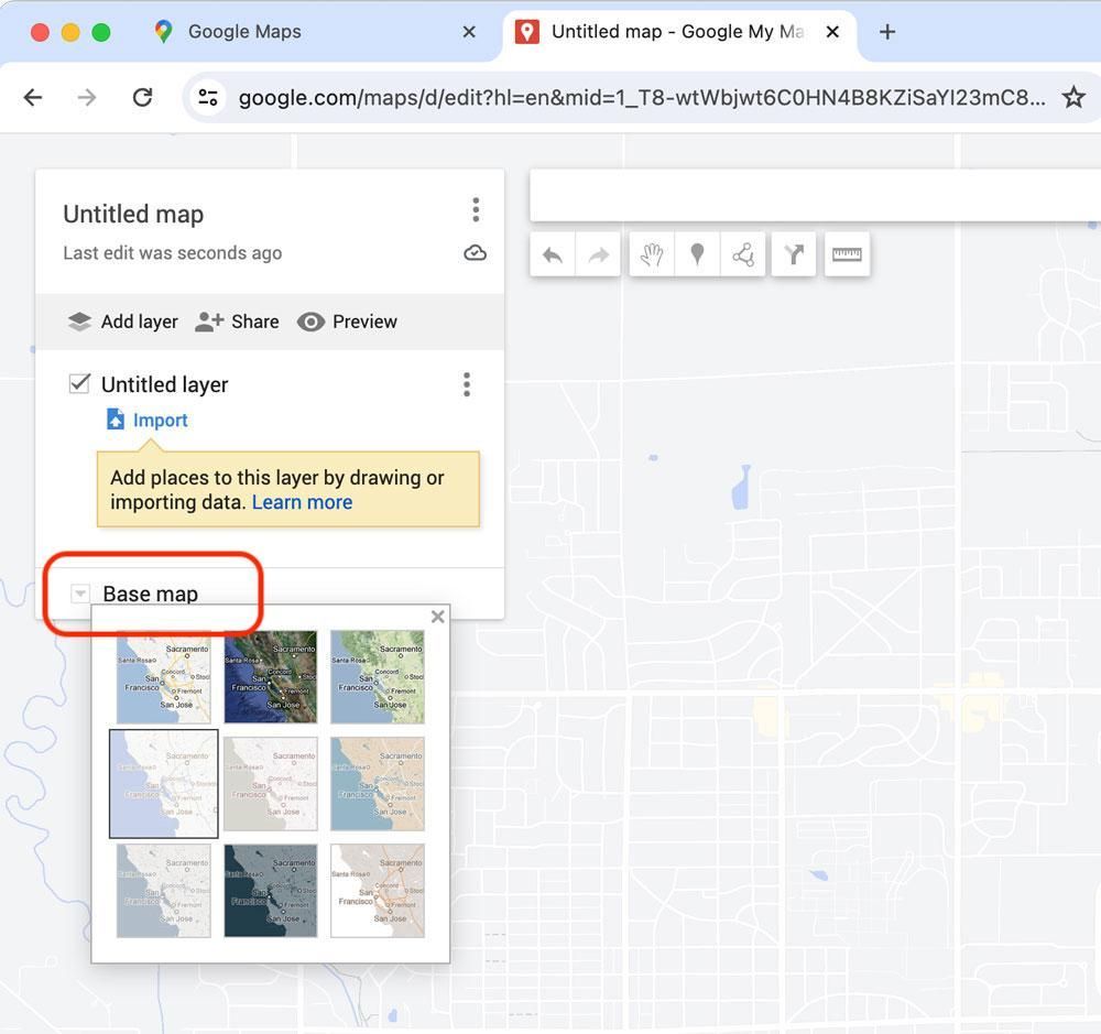
- Zoom into your area of service
- In the box in the upper-left where it says
Untitled map, click that and add a map title.
- Below that, click on the down-button next to
Base map to try different base map styles. Some have a lot of detail, some have very little.
- The best base maps to use for route maps are usually the simpler styles with light colored backgrounds and white roads.
- Note that these colors may change as you zoom in or out, so get to the proper zoom to see your whole service area before selecting your base map style.
- You can add street names and other details later, so you may prefer a base map style with little to no text on it.
- Now you can take a screenshot to save a basemap if you will create your map in a graphics program. Or if you’d like to try drawing your routes right in Google Maps, follow the instructions below.
Draw your Routes in Google Maps
After setting up your base map using the steps above, you may draw your routes right in Google Maps. This isn’t a perfect solution, and does have limitations, but it might work for you.
- If you wish to create layers for different routes, click on
Untitled layer and change the layer name.
- Click on the
Draw a line tool, and select
Add line or shape.
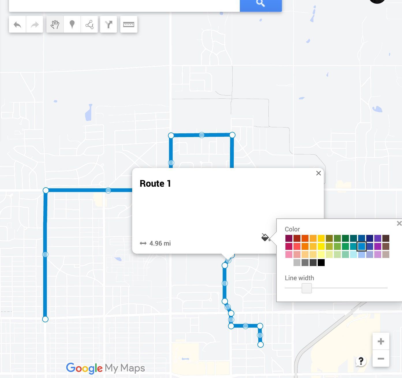
- Start drawing your route by clicking on the map.
- Double-click to end your line.
- You may zoom in and out to get more accurate detail.
- Name the line if you wish (not required) and click
Save.
- Click the
Style button and select a line color and line width
- Note that line width stays the same when you zoom in or out of your map, so to set a good line thickness, first zoom to the whole service area that you’ll be showing.
- After your line is drawn, you can edit it by clicking the line and grabbing any point along the line and dragging in. You can add more detail by selecting one of the mid-points on a segment and dragging that.
- You may also add symbols to your map, but it may be easier to do that later in Canva or another graphics program.
- When finished with your route lines, take a screenshot to save the map to your computer.
Import your Map into Canva
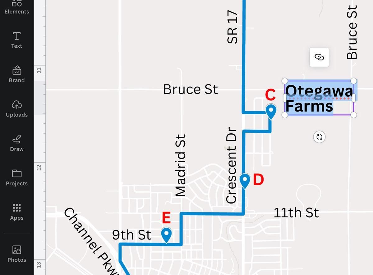
You can import your map into Canva, where you can add street names, route numbers, landmarks, symbols, etc.
Simply use the
Text tool to drop text onto your map. If you want to use any icons or shapes to identify bus stops or landmarks, click on
Elements in the left toolbar.
- Keep the size of your text consistent. For example, street names should all be the same font, size, and boldness.
- Use a different font, font size, color, or boldness to identity landmarks than what you use for street names.
Using your map in other Canva designs
When you’re finished designing your map, you may want to group all of the elements together so that you can move it or scale it as a single item, and so that you can easily copy/paste it into another design.
Or you can save your map as a graphic by pasting it into a new blank Canva design and clicking the “Share” button, then selecting “Download” and saving it as a JPG, PNG or SVG file. Then you can drag that file into your Canva “Uploads” panel to use it in other Canva designs.
Exporting your map for other uses
Paste your map into a new blank Canva design, and click the “Share” button, then select “Download” to save it as whatever file type you’d like. A PDF file is useful for sharing via email or for printing. JPG or PNG files may be preferred for use on your website.
Video Tutorial
Making route maps using Google Maps and Canva
This video walks you through the process outlined above for creating a basemap in Google Maps and adding details to the map in Canva.