Branding A Family of Services
Marketing Toolkit
Branding: A Family of Services
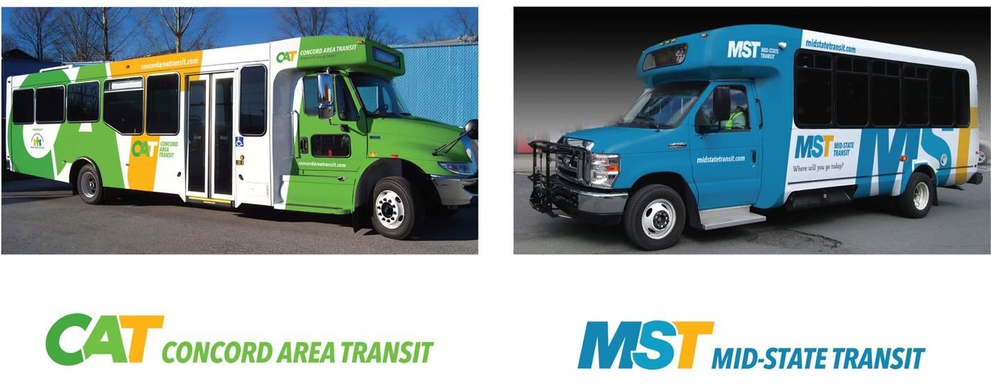
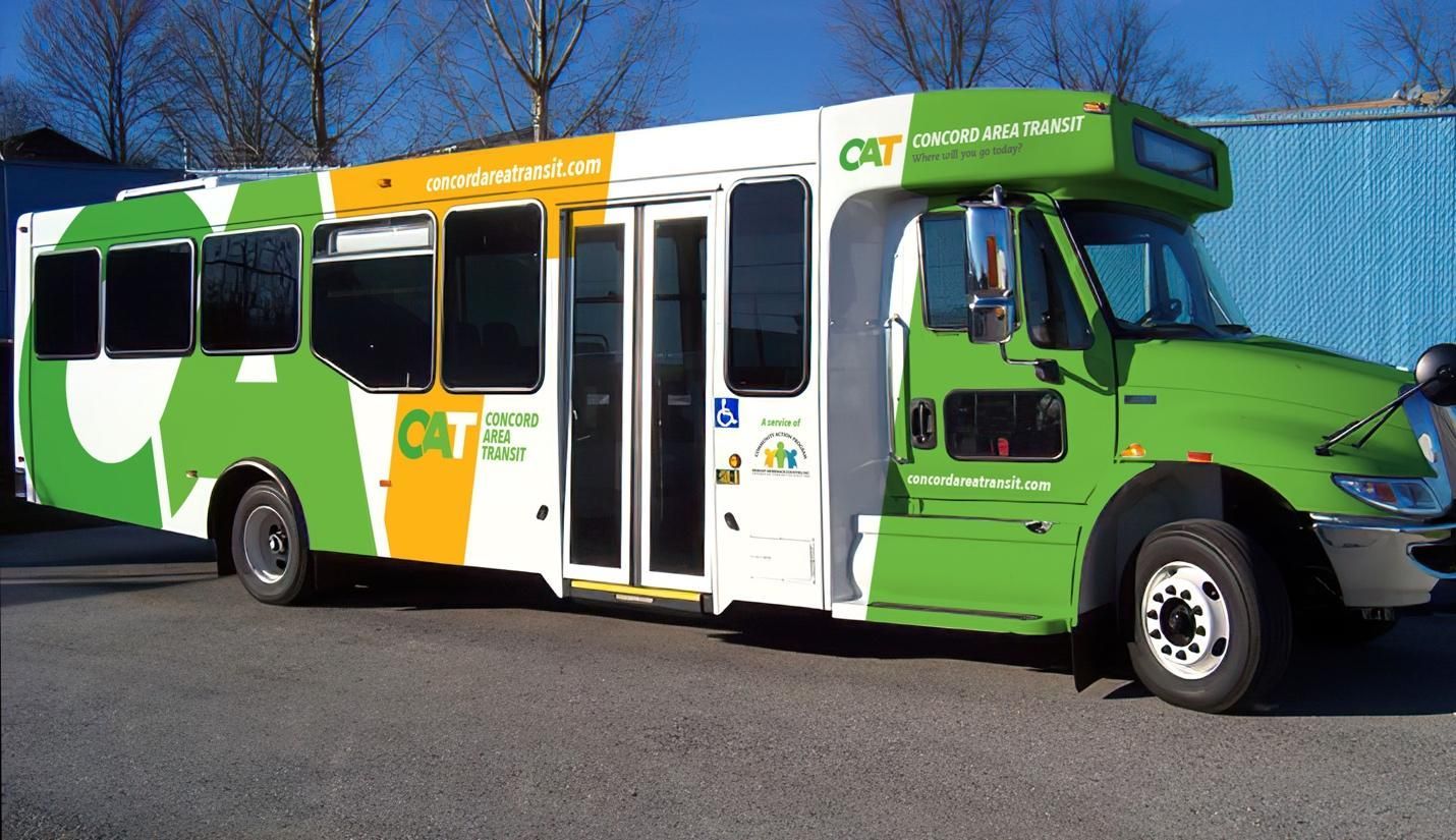
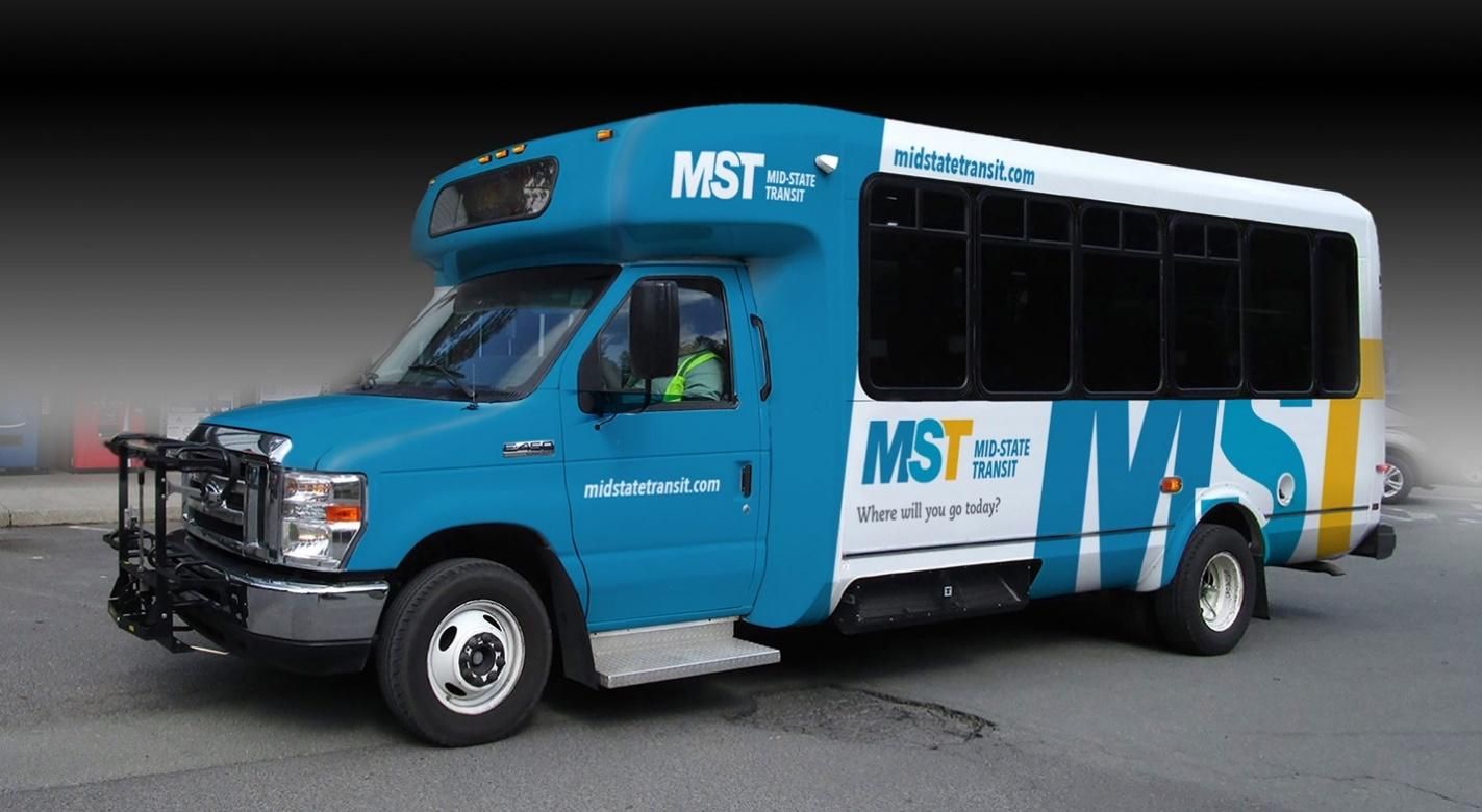
The Belknap-Merrimack Community Action program operates fixed-route service in Concord, NH, and demand-response service throughout its two-county region. To increase visibility for both services, bold new vehicle graphics were created that were distinct for each service, but which used a common style to create a “family of brands.”
Concord Area Transit (CAT) was branded in bold green and gold, with the front of the bus solid green to establish a highly visible on-street presence. Mid-State Transit (MST)–the demand-response service–was branded in blue and gold with a similar vehicle design.
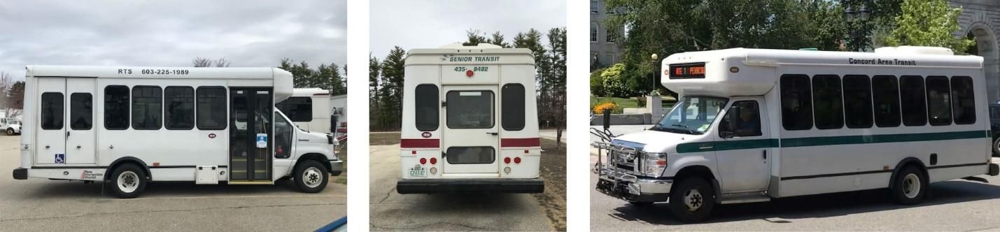
Prior to this branding effort, the previous vehicles had been a fairly indistinguishable white with virtually no design. The bold new look of the re-branded buses immediately increased visibility for both the local and rural services, resulting in ridership growth.
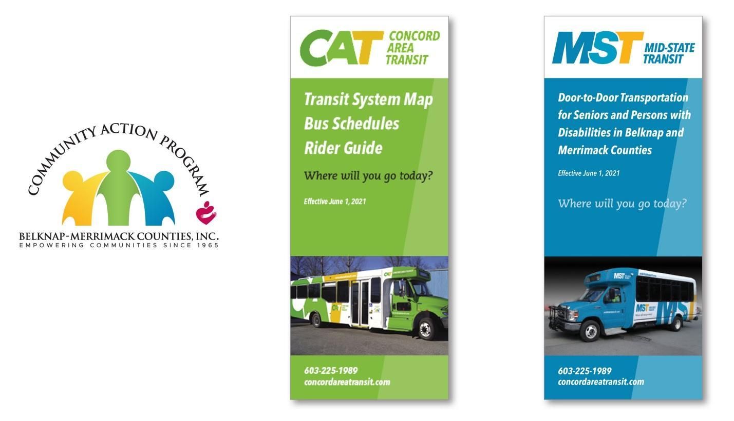
The branding, carried through on guides for each of the services, clearly demonstrates the relationship to the parent brand. The colors were all pulled from the parent agency’s logo which was displayed in a small version on the vehicles and on the back of the brochures.
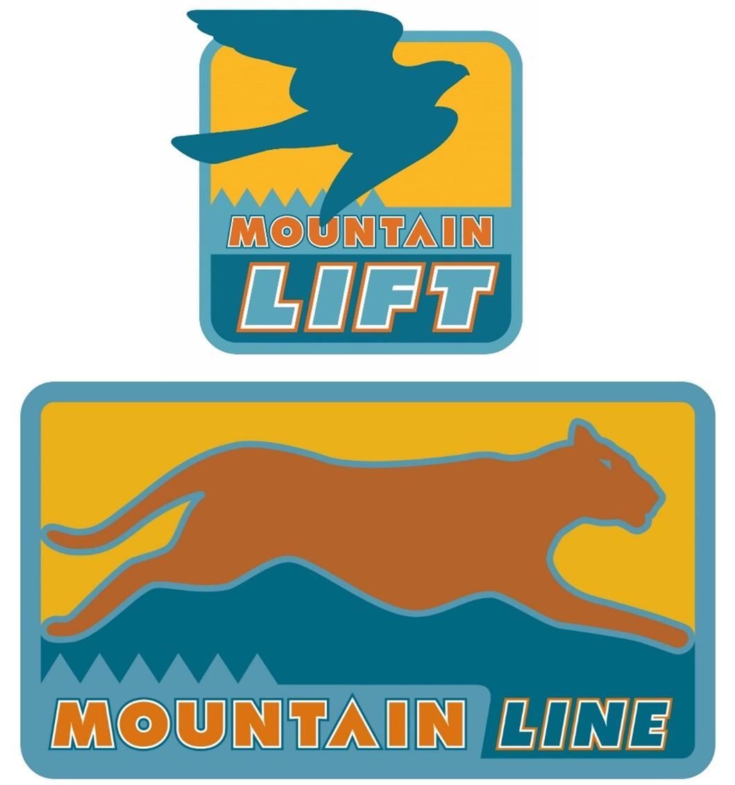
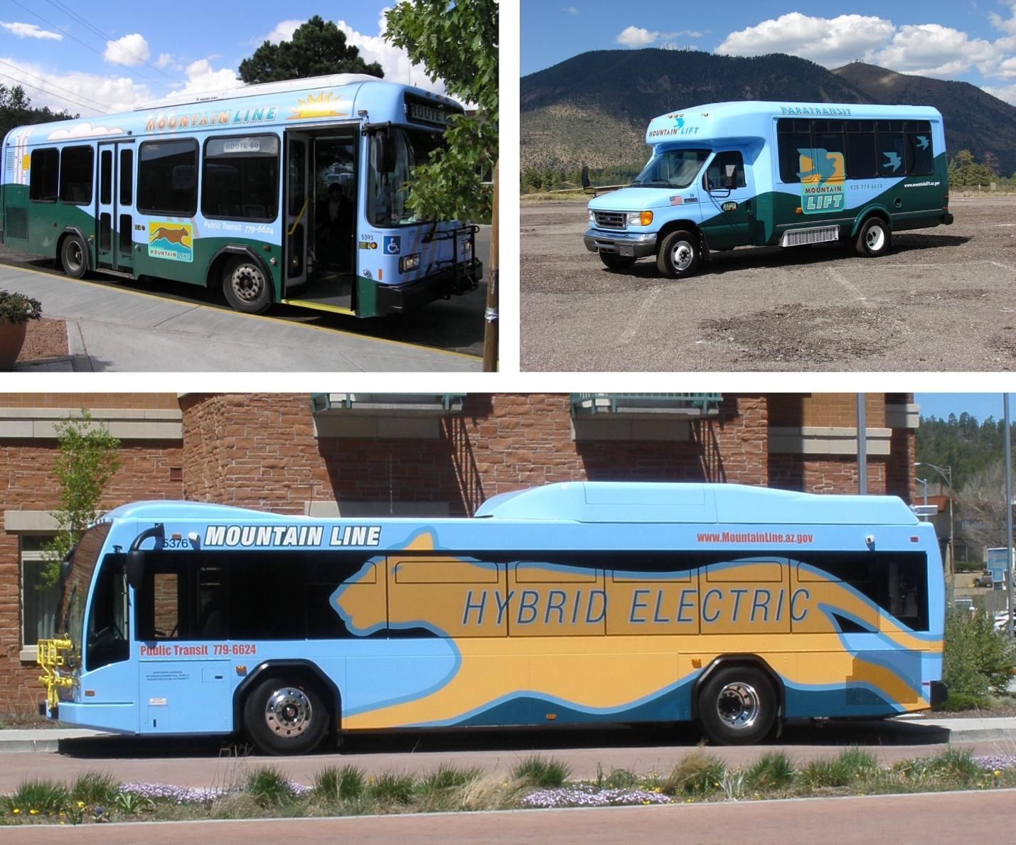
Northern Arizona Intergovernmental Public Transit Agency in Flagstaff, Arizona, like many transit agencies, operates both fixed-route and paratransit services.
Their fixed-route service has always been called Mountain Line with a logo that ties into the mountain cats of the region, known for their speed and agility. However, their paratransit had an unrelated name. To bring the services together as a system, the paratransit was rebranded as Mountain Lift with a coordinated logo and the symbol of a soaring bird to communicate the freedom that transit offers persons with mobility limitations.

A program of the Federal Transit Administration administered by the Neponset Valley TMA
National RTAP is committed to making this website accessible to persons with disabilities. If you need assistance accessing any content on our website or need alternative formats for our materials, please contact us at info@nationalrtap.org or 781-404-5020.